CVS Health Unified Checkout
Streamlining complex prescription fulfillment into a seamless, user-centric checkout experience.
Overview
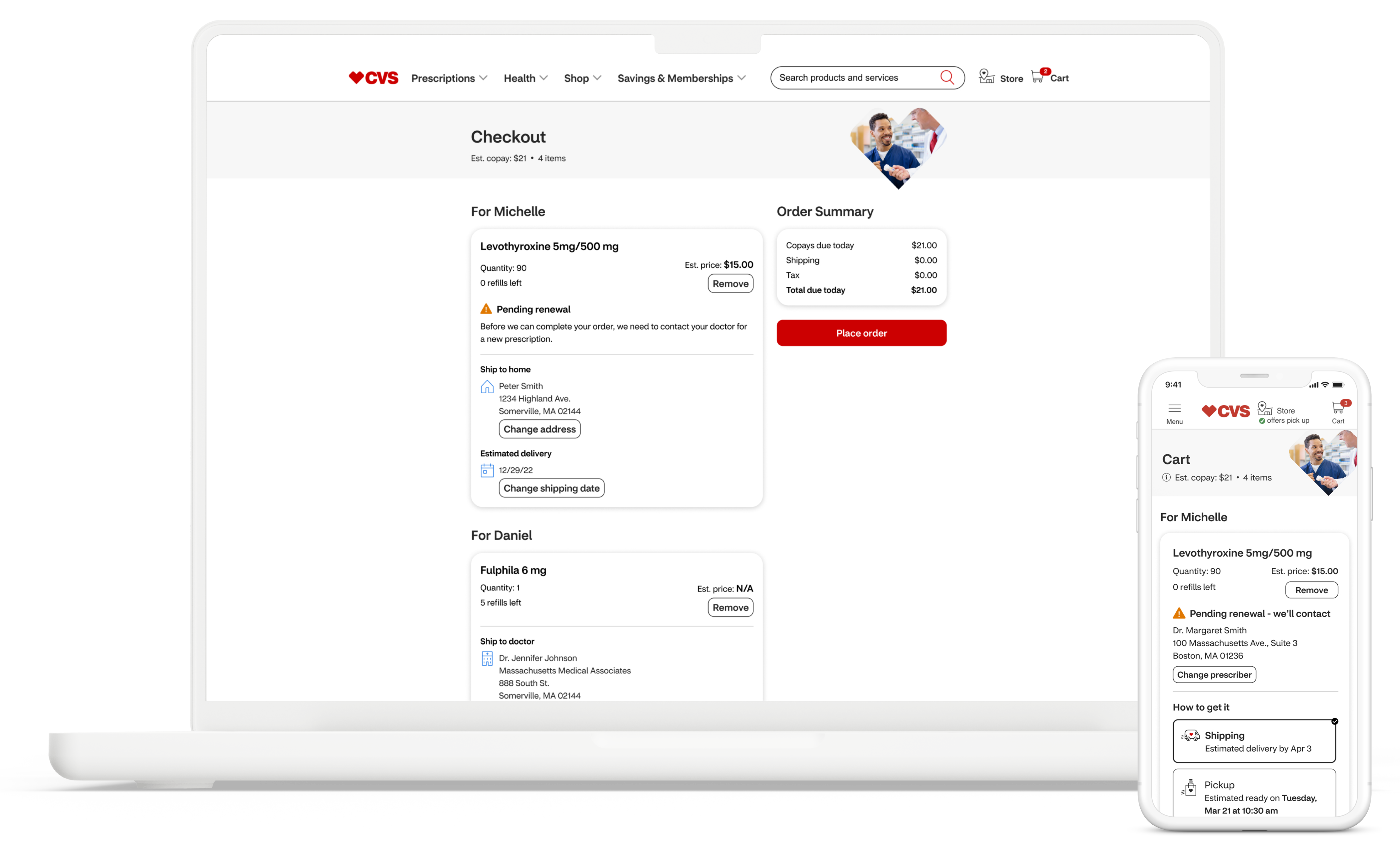
Unified Cart was an ambitious project to unify the checkout experience across its multiple lines of business: CVS Caremark, CVS Specialty, and CVS Retail. The primary goal was to streamline the checkout process for users, particularly caregivers managing medications for themselves and dependents, while navigating the complexities of prescription fulfillment. A cross-functional team was assembled to tackle this challenge through a focused design sprint.
Role
UX Research Strategy, Comparitive Analysis, Ideation, Wireframes, User Testing Strategy, Interaction, UI Design
Team: Design Lead, 2 Product Designers, 1 Product Manager, Engineering
October 2022 - April 2023
The Problem
CVS Health customers, particularly caregivers, struggled with a fragmented checkout experience across multiple lines of business (Caremark, Specialty, and Retail). This led to confusion, wasted time, and frustration when managing prescriptions with varying fulfillment requirements for themselves and dependents.
The Solution
We designed a unified, three-step checkout process that seamlessly integrates prescriptions from all CVS Health services. The new system dynamically adapts to different medication fulfillment restrictions, clearly communicates options to users, and simplifies the overall experience—all while maintaining compliance with healthcare regulations.
Discovery & Research
The sprint began with a comprehensive discovery phase. Stakeholder interviews were conducted with representatives from each line of business, revealing the intricate backend processes and regulatory requirements that influence prescription fulfillment. These interviews highlighted a critical constraint: the need to accommodate varying fulfillment methods, including mandatory delivery for some medications, pharmacy-only pickup for others, and doctor's office pickup for specific prescriptions.
Pre-sprint research provided valuable quantitative and qualitative data, offering crucial insights into user behavior and pain points. Our survey results revealed interesting patterns in how users manage prescriptions and interact with CVS Health services.
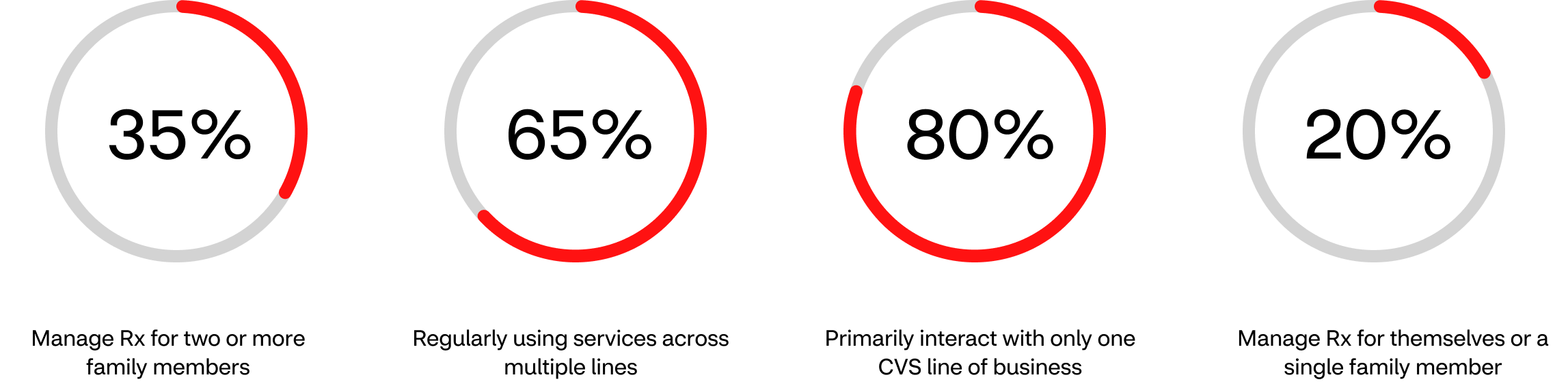
These findings underscored the need for a unified system catering to both simple and complex user scenarios. While most users have straightforward needs, a significant minority navigate more complex situations, often expressing frustration with managing prescriptions across multiple platforms. This insight pointed to a clear opportunity for improving our checkout process, emphasizing the importance of a solution that simplifies the experience for all users while accommodating those with more intricate requirements.
User Definition
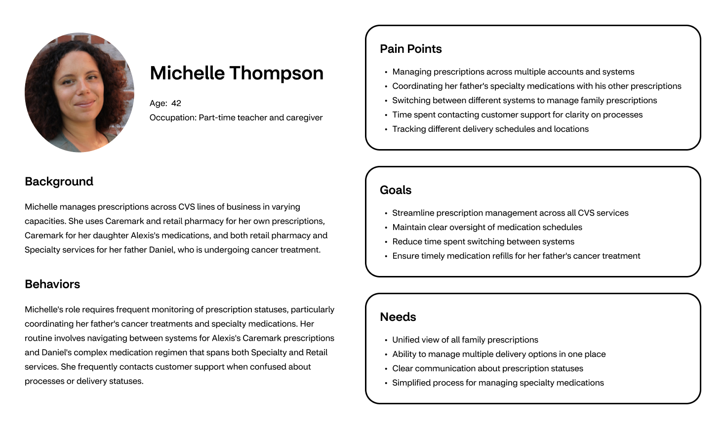
Through our research, we identified caregivers managing multiple prescriptions across CVS services as our primary focus. Our persona, Michelle Thompson, represents this user segment as she coordinates Caremark prescriptions for her daughter Alexis while managing her father Daniel's cancer treatment through both retail pharmacy and specialty services.
Journey Mapping
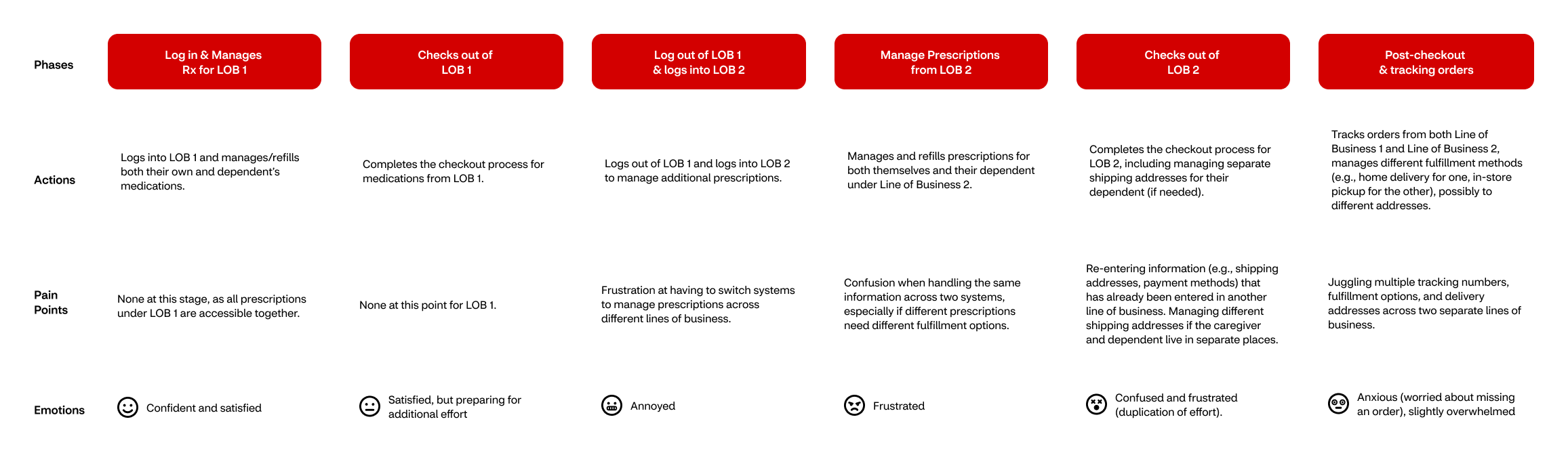
A journey mapping exercise was then conducted, tracing Michelle's path through the current checkout process. This activity unveiled several pain points, including confusion about fulfillment options, frustration with repetitive data entry across different systems, and uncertainty about order status for prescriptions with different fulfillment methods. The journey map became a cornerstone for the team's understanding of user needs and a reference point for ideation.
Current State
While CVS Health offers robust prescription management across its lines of business, the user experience varies significantly between each system. A closer examination of these interfaces reveals both overlapping patterns and distinct differences in how prescriptions are managed and fulfilled.
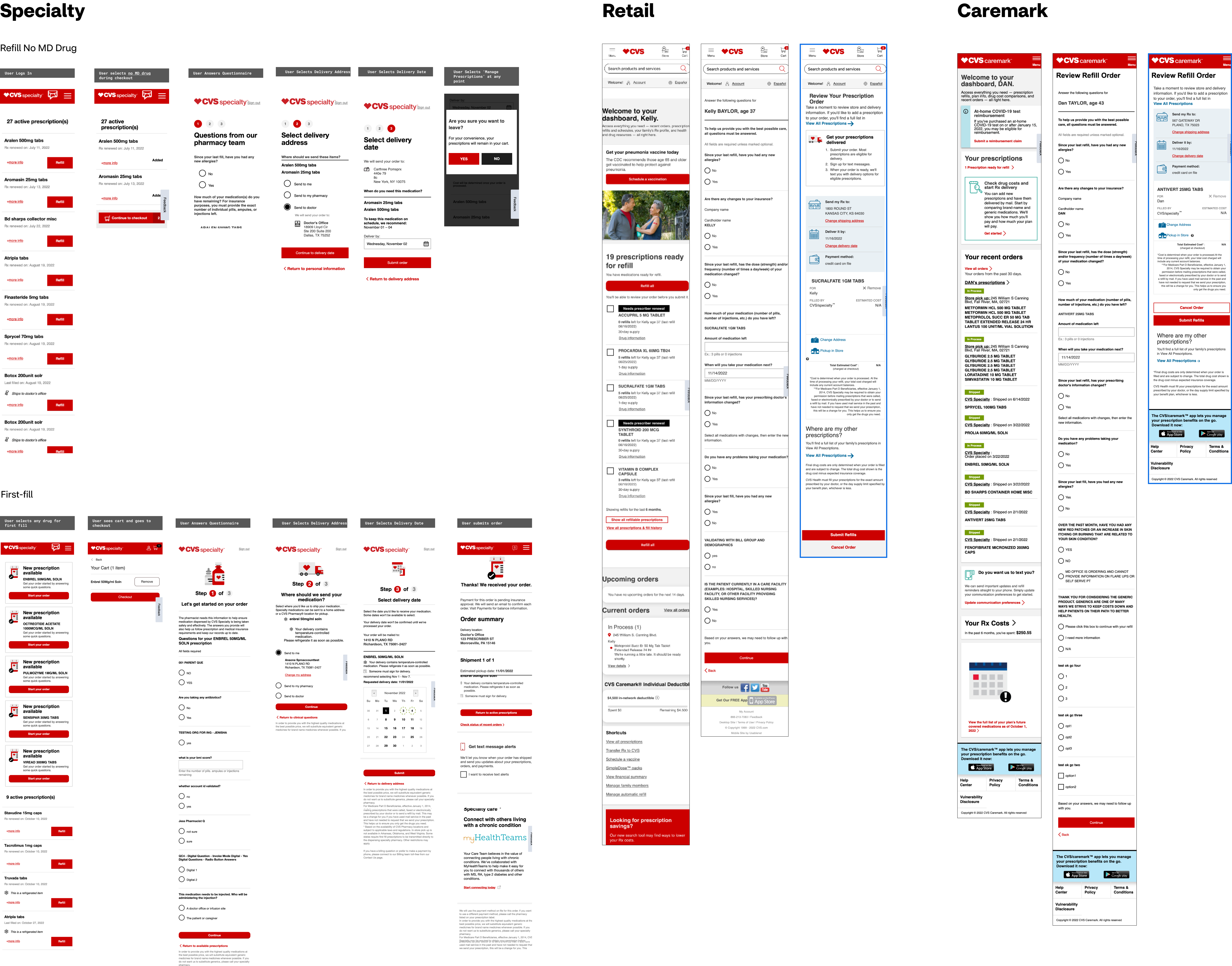
Competitive Analysis
To understand the current market landscape and identify opportunities for innovation, we examined how different companies handle prescription management and fulfillment.
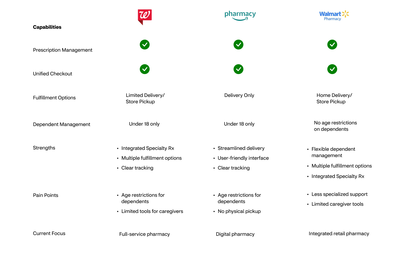
Our analysis revealed that while competitors offer unified checkout and various fulfillment options, each has distinct limitations. Walmart's removal of age restrictions for dependent management stands out as a key differentiator, yet the market still lacks a comprehensive solution that combines integrated specialty prescriptions, user-friendly interface design, and flexible dependent management in a single platform.
Ideation
Following our research phase and analysis of current systems, we conducted a structured ideation exercise to bridge our findings with potential solutions. This process helped us organize key considerations and constraints before moving into design explorations.
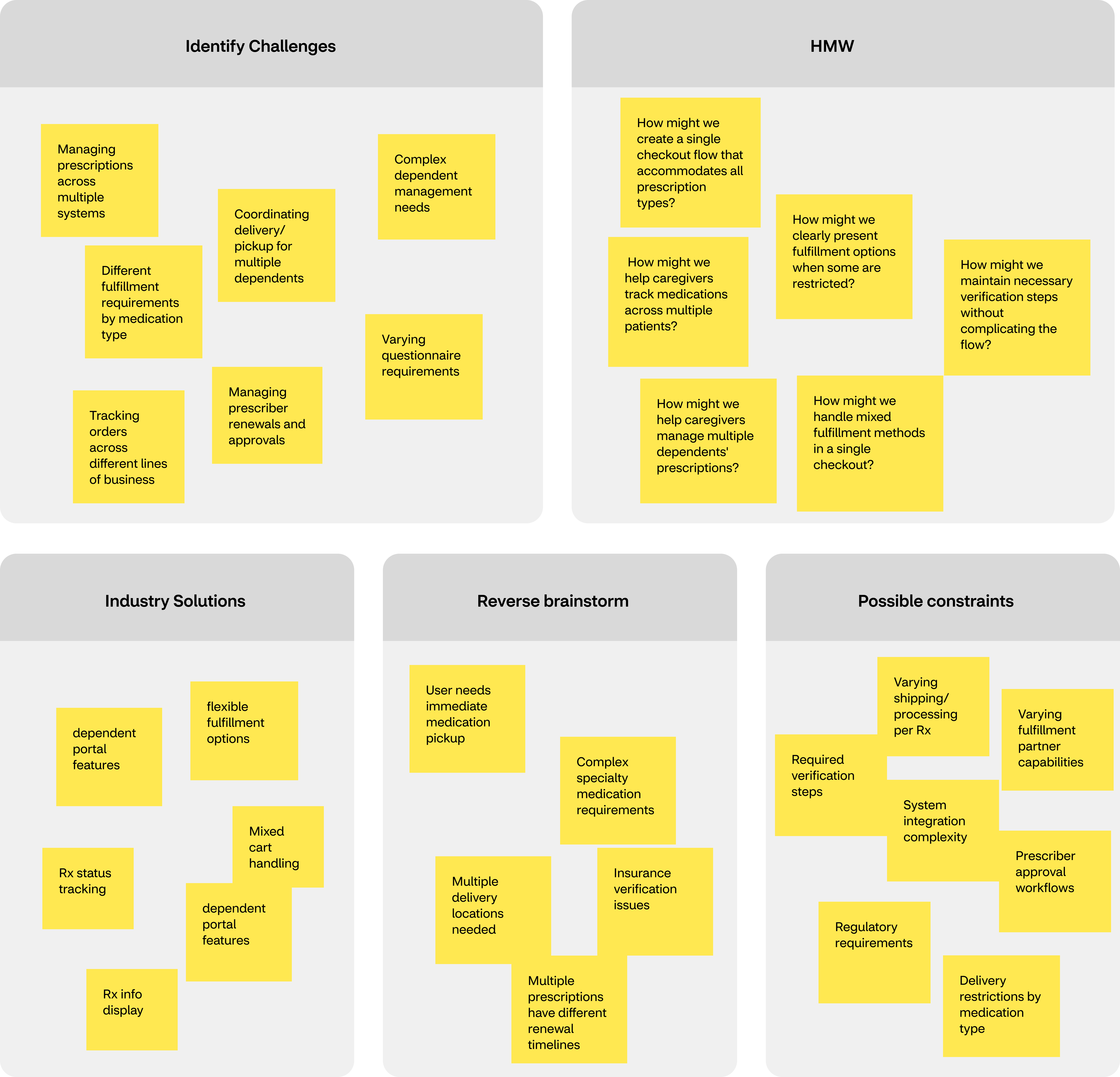
Our exercise revealed the complexity of handling different fulfillment requirements within a unified checkout flow. While prescription management occurs upstream, our checkout solution needs to handle varying delivery and pickup requirements, verification processes, and questionnaires. For users like Michelle, this means creating a clear path to coordinate different fulfillment methods across her family's prescriptions, whether they're being delivered to home, picked up at a pharmacy, or requiring doctor's office coordination.
Initial Explorations
Early sketches explored how to maintain a simple, three-step checkout flow while accommodating complex fulfillment scenarios. A key consideration was whether to group prescriptions by fulfillment method or by user. Each approach presented different advantages for organizing and tracking medications. The challenge lay in thoughtfully incorporating these grouping decisions alongside fulfillment options and questionnaires while preserving the familiar checkout pattern users expect.
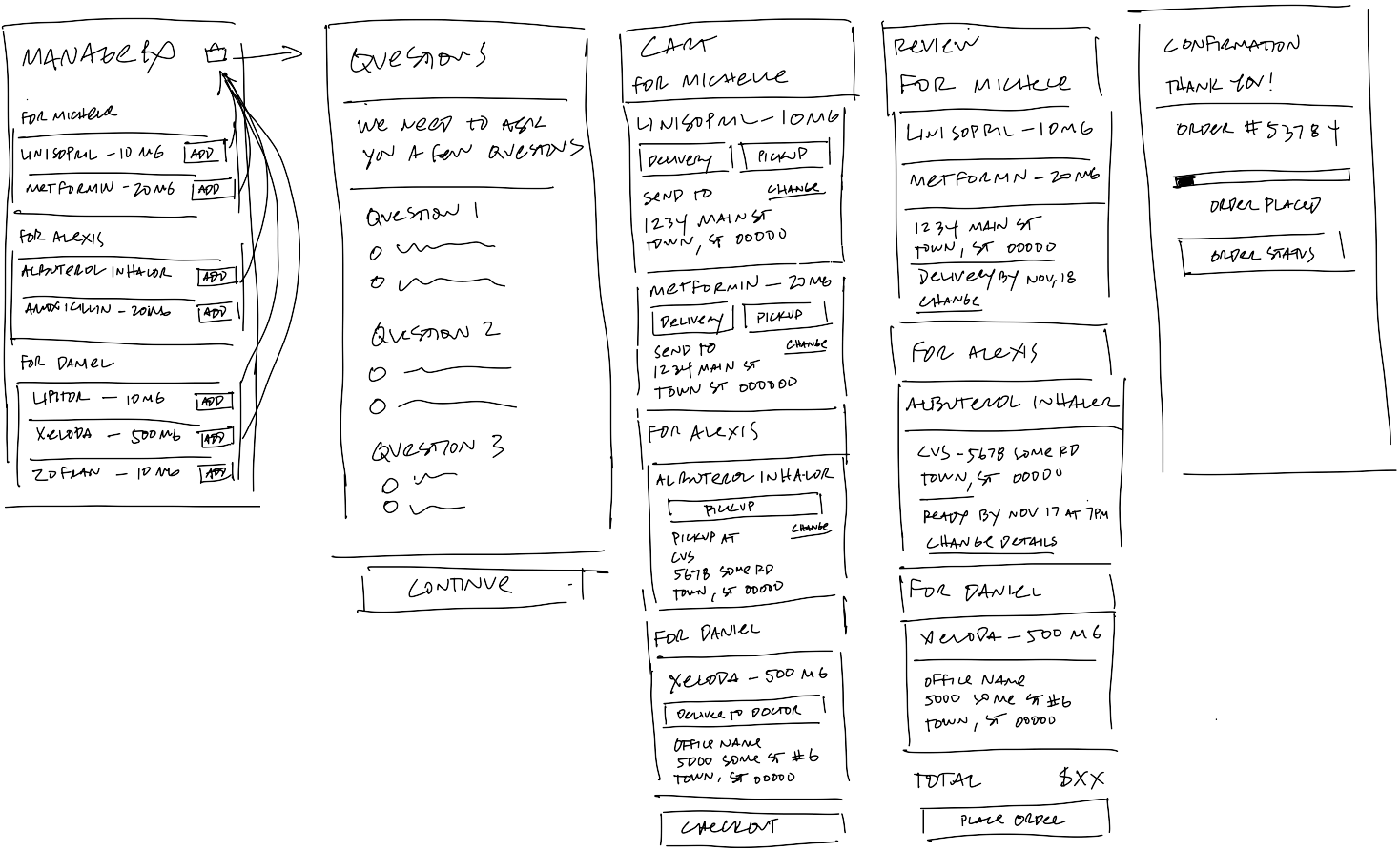
These organizational approaches raised further questions about questionnaire placement within the flow. We explored whether questionnaires should appear immediately after prescription selection, during fulfillment choice, or just before checkout completion. Each placement option presented different implications for the user experience.
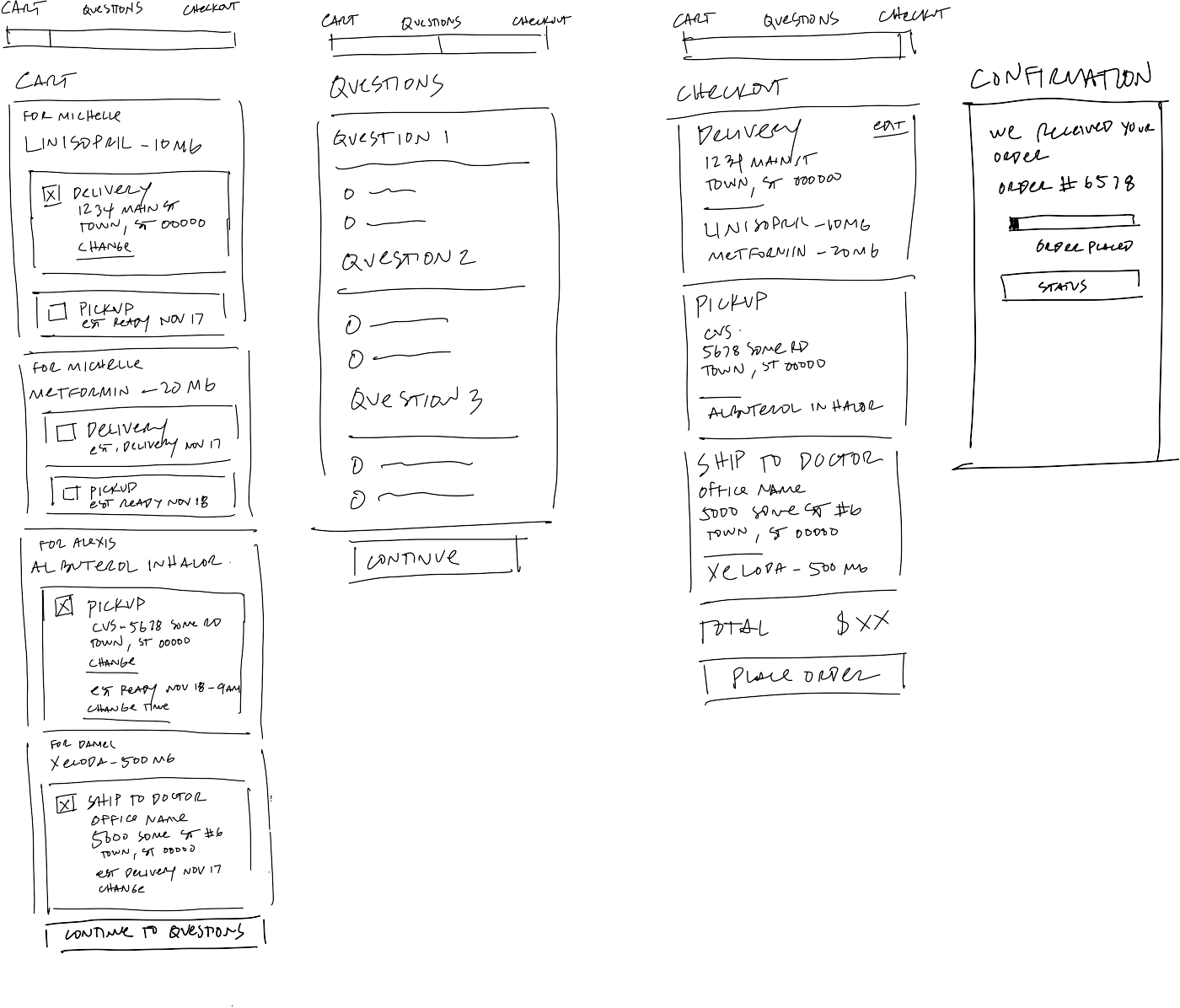
Wireframes
From our design exploration, we developed two interactive prototypes to test our approaches. Each prototype maintained our three-step checkout structure while testing different organizational methods.
The first prototype explores grouping prescriptions by family member, allowing users to manage medications and their fulfillment options within each person's context. This approach maintains a clear connection between family members and their medications throughout the checkout process.
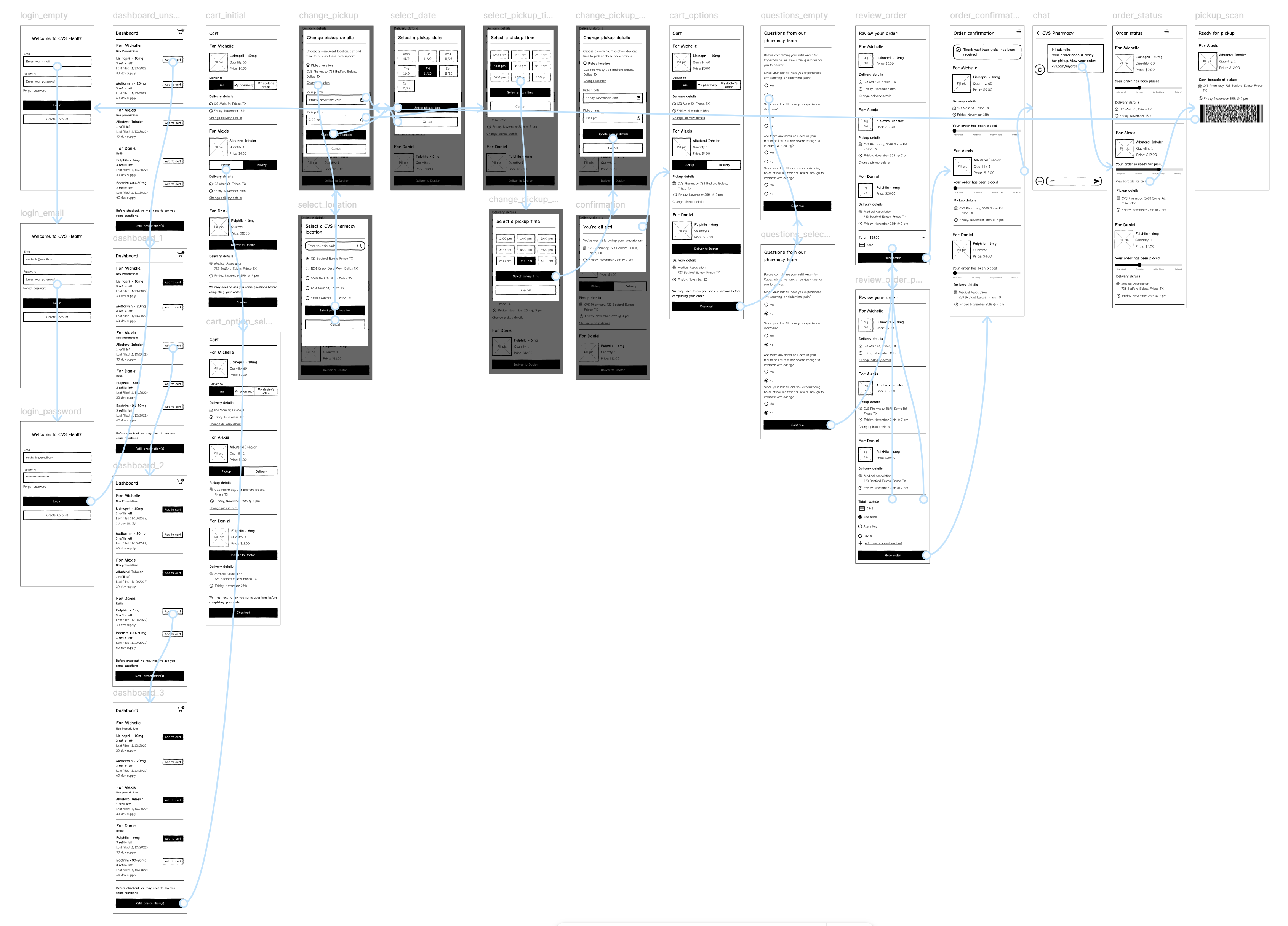
The second prototype organizes prescriptions by fulfillment method, grouping together items that share delivery or pickup requirements. This approach potentially simplifies the coordination of similar fulfillment methods across family members.

Both prototypes needed to elegantly handle questionnaires and maintain a clear progression through the checkout process, regardless of organizational method. Through user testing, we aimed to understand which approach would better serve caregivers like Michelle while managing complex prescription scenarios.
Testing
Working with our UX researcher, we established a testing strategy to evaluate our organizational approaches. For initial testing during the sprint, we conducted sessions with caregivers who manage multiple prescriptions for family members, allowing us to validate core organizational preferences before moving to more specific user scenarios.
Participants interacted with both wireframe prototypes, completing the same checkout scenarios with prescriptions grouped by patient and by fulfillment method.
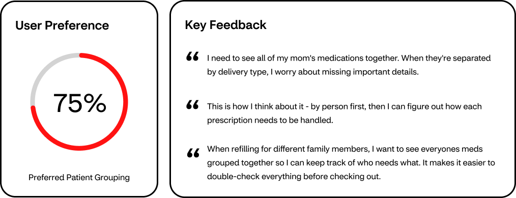
The feedback consistently favored organizing prescriptions by patient, with users expressing that it better matched their mental model of managing family healthcare. This insight not only guided our direction toward a patient-centered grouping approach but also indicated the need for future testing with CVS users who manage prescriptions across multiple lines of business.
UI Explorations
Starting with our validated user flow, we explored different approaches to organizing prescriptions within the cart. These explorations helped us understand how to best present grouped prescriptions while maintaining clear access to fulfillment options.
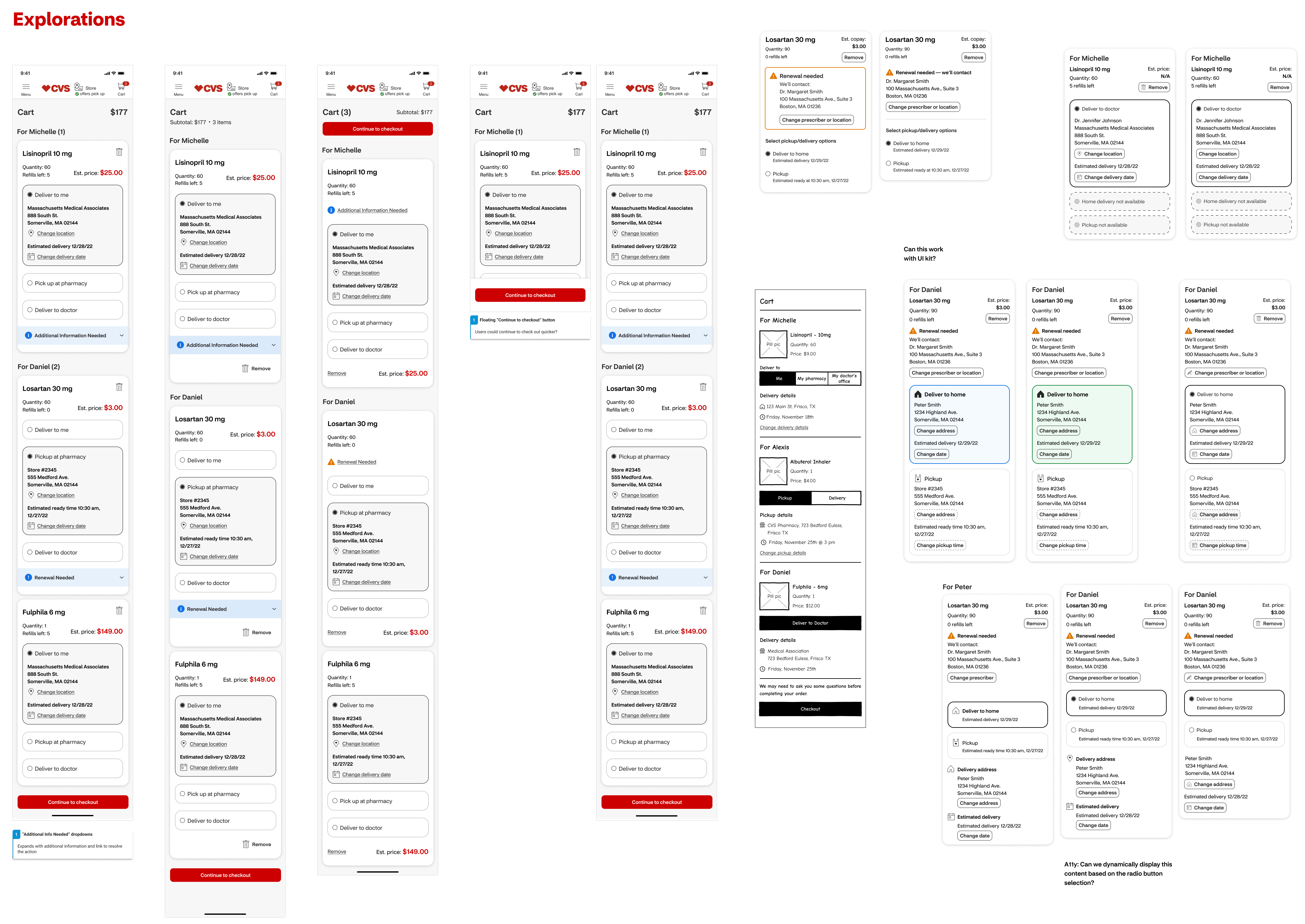
These explorations helped us work through key challenges around prescription presentation and organization. We tested various card layouts and grouping methods, always keeping in mind the need for a scalable solution that could support additional features in future iterations.
Solution
Our final design presents an organized checkout experience that prioritizes patient grouping while accommodating various prescription fulfillment needs. The three-step process maintains clarity through progressive disclosure.
Cart
Prescriptions are grouped by patient, with clear fulfillment options and important status indicators like pending renewals or special handling requirements.
Checkout
Users can review and modify delivery details or pickup locations while maintaining the patient grouping structure.
Confirmation
Order summary provides a comprehensive view of each prescription's status and next steps, organized by patient
Next Steps
The design sprint established a solid foundation for unifying CVS's checkout experience, validating our approach to organizing prescriptions by patient while managing complex fulfillment requirements. Our research and testing confirmed that users strongly prefer seeing all medications grouped by family member, supporting our decision to maintain this organization throughout the checkout flow.
Building on this framework, we identified several crucial features requiring deeper exploration. The need to change pickup locations, modify delivery addresses, and manage scheduling emerged as key touchpoints during our initial testing. These features were strategically distributed across subsequent sprints, allowing our team to thoroughly explore each interaction while maintaining the cohesive experience established in our initial framework.
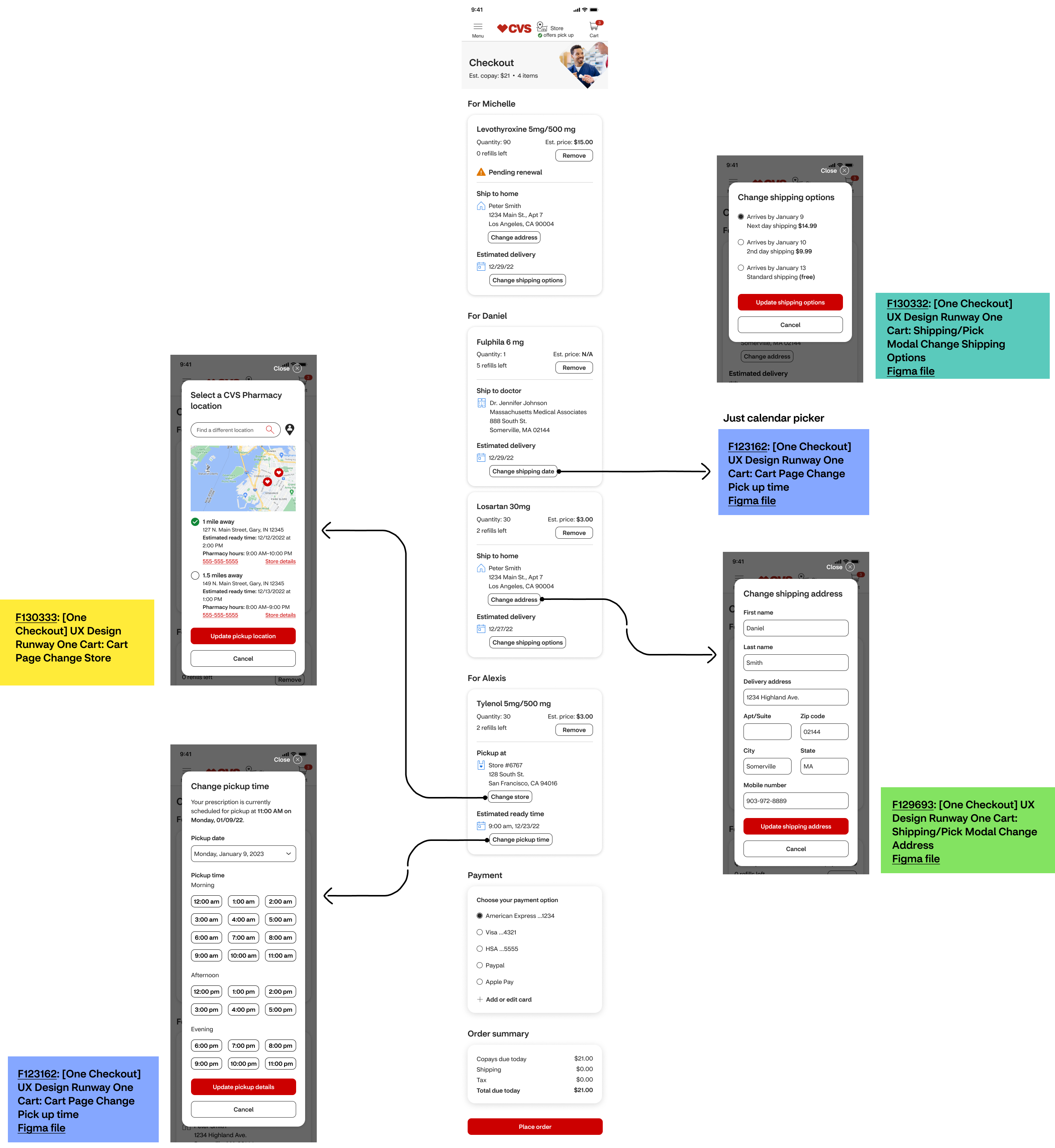
This phased approach enabled us to tackle complex functionality systematically while staying true to our core organizational principle. Each feature would maintain patient grouping as the primary structure, ensuring that future enhancements would build upon rather than compromise our validated solution.
The project demonstrated that even within complex healthcare systems, maintaining clear organization and progressive disclosure can significantly improve the user experience. By establishing this foundation, we created a scalable framework that could evolve to meet both user needs and business requirements.